The site uses an adaptive design. The layout will change according to your device or your screen resolution. Below a certain display area, or if you're visiting using a smartphone, the design will change to become easier to read. From my tests (although I don't have access to many different models), this seems to work fine.
I strongly advise you use an up-to-date Internet browser. With older browsers, the display will be messy, parts of the text will appear in the wrong position, with wrong colors, and some areas might become unreadable.
If you haven't already done so, I strongly suggest you download the most recent version of one of the following browsers:
Chrome Explorer Firefox Opera Safari
(click on the logo of the browser of your choice to access its official download page)
I am not a professional web designer, and I don't have the time, the will or the skills to make specific versions for older browsers that are not compliant with today's standards.
Back to the home page
Click on the main title banner at the top of each page to go back to the home page.
Main menu
On computers, a scroll-down menu is available on each page and allows you to access with one click to any page of the site. Just hover your mouse to scroll down the chosen category, and click on the section you want. This menu is always the same, wherever you are in the site, although it may be displayed with different colors depending on the section you are in.
On smartphones and tablets, the scrolldown menu is replaced with a dedicated menu page, accessible from any page by simply touching "Site map" located at the top of each page, just below the title banner. This gives you access to the complete menu. Each page of the site is represented by a button that you simply need to touch. Each section is represented by a different color (tutorial is blue, simulators are cyan, etc.). Colorful, convenient and swift, the buttons are big enough to be easily accessible, even from a smartphone screen.
Locating yourself in the site
At the very top of each page, above the title banner, you will find an indicator of your position. For example, it will tell you that you are in the "Tutorial" category, in the "Rhythm guitars" page of the "Mixing in practice" section. Just touch any part of this line to access the corresponding page.
"Top of page" and "Top of paragraph" icons
In order to limit scrolling up and down, I tried to add contextual menus wherever necessary, usually at the top of the pages, in order for you to be able to jump directly to the part of the page you are interested in. Links are displayed with a different color than the rest of the text.
Also, you will see that various icons separate sections of text within a page. The icons located inside a block allow you to jump back to the top of the block, whereas the arrows pointing up between blocks will take you to the top of the current page.
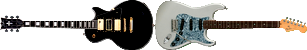
For example, clicking on these guitars will take you to the top of this block:
Click on the arrow to go back to the top of the page:
English and French versions
At the very top of each page, you will find a flag icon that allows you to go from English to French and vice-versa. All pages are not yet available in English, but I'm working on it.
If a page is missing in English, you can still go to the French site and find the download link or the audio sample you might be looking for. This doesn't require to fully understand French. Just in case you're searching a page for a download link, "download" is "télécharger" in French.